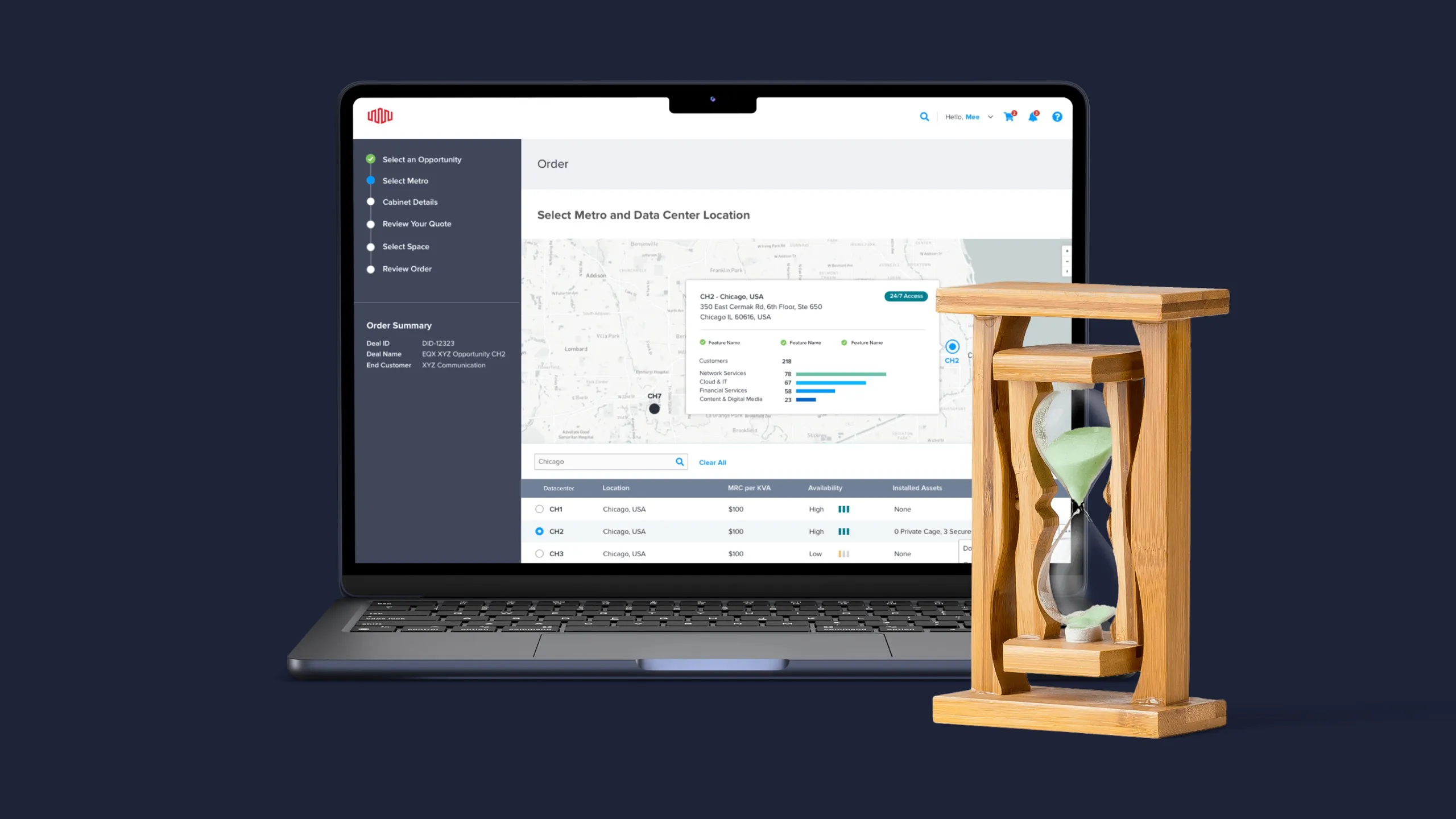
Case study
Exploring how to monitor a data center
Leveraging user research, competitive analysis, and design to evaluate the feasibility of rebuilding a data center monitoring tool.
- Company
- Equinix · via Orium
- Role
- Product Designer
- Timeline
- 3 months
- Year
- 2020
What I owned
- Led research, design & strategy
- Ran the UX audit and contextual inquiry
- Owned the feasibility ("don't build") recommendation
Outcomes
- Saved significant development cost by identifying the right solution through research
- Surfaced the workarounds users had quietly adopted, giving leaders concrete data to act on
- Informed a vendor selection that met real user needs — without building from scratch
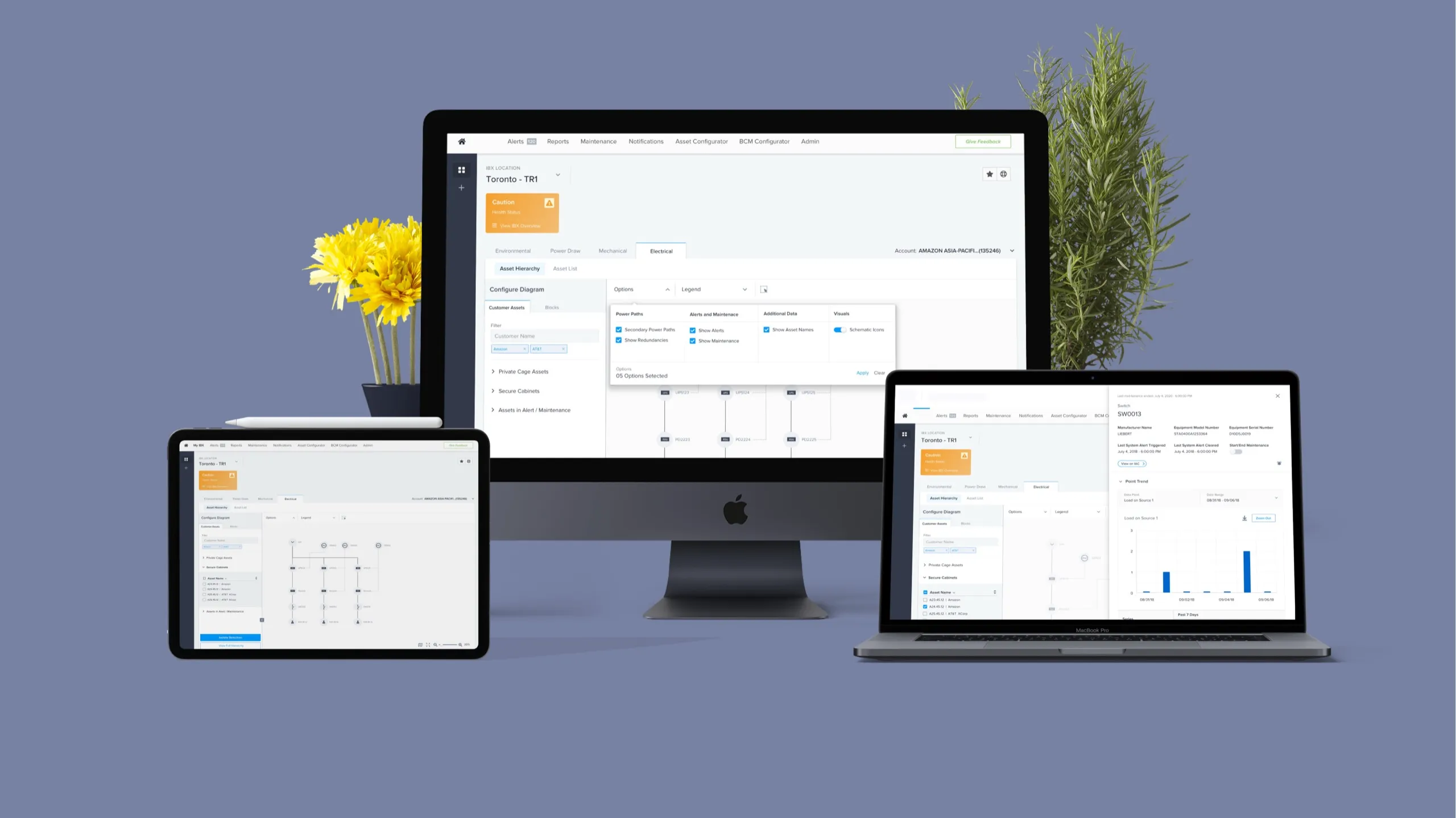
Data centers have a physical map showing how servers are powered and who they belong to. Equinix, the market leader in colocation services, needed their monitoring tool redesigned for usability, performance, and aesthetics. Over three months I led research, design, and strategy to figure out whether a rebuild was the right path forward.
Why nobody used the tool
We were told the tool existed but nobody used it. Before touching a wireframe, I wanted to understand why.
UX audit — A heuristic evaluation surfaced performance, usability, and accuracy issues severe enough to make the tool virtually unusable in practice.
Stakeholder interviews — Sessions with internal teams confirmed what the audit suggested: no one wanted to use this tool. The usability problems had eroded trust completely.
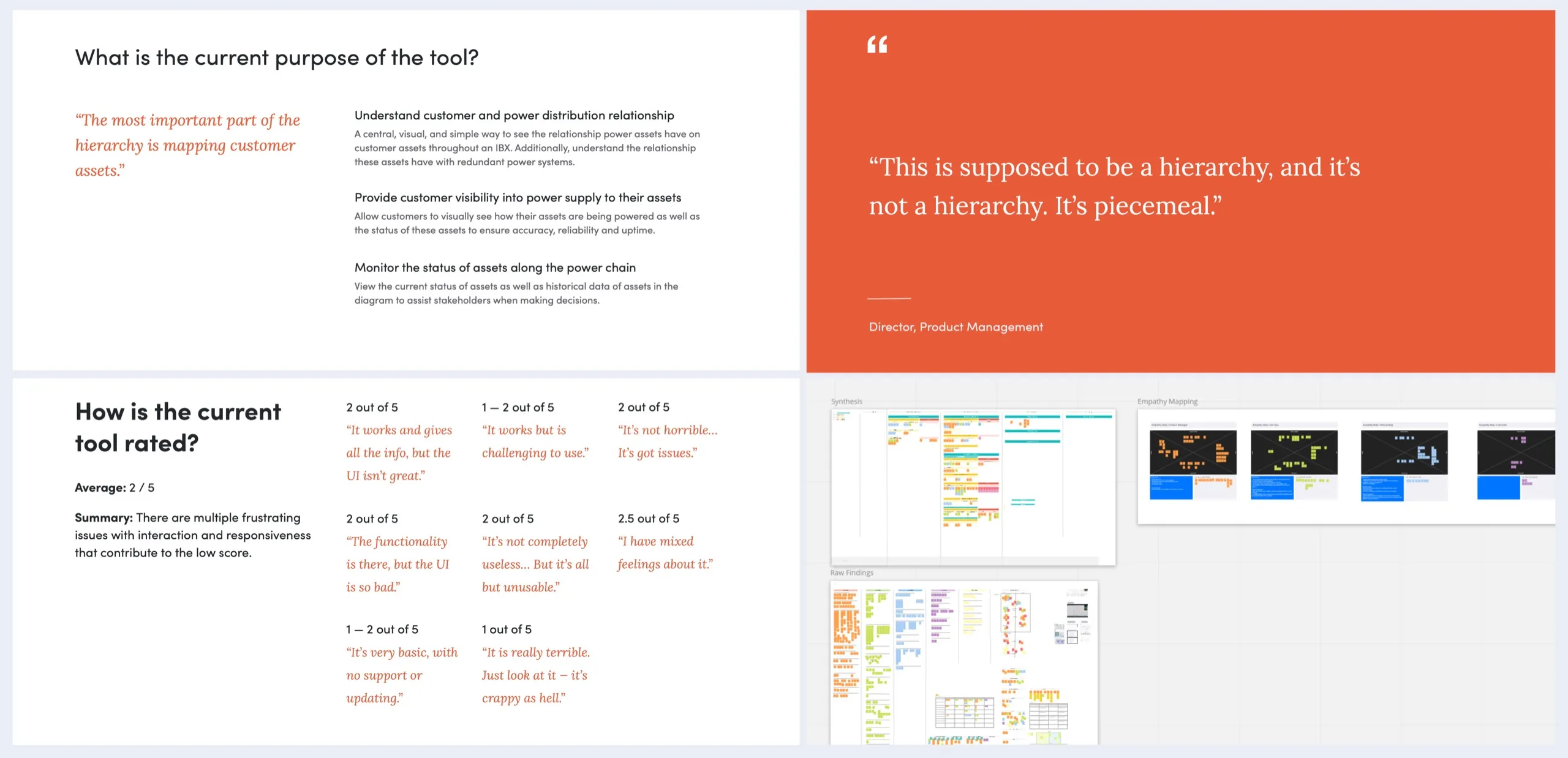
Contextual inquiry — Speaking with users and customers across the globe revealed something more significant: no one was using the tool at all. They had built their own workarounds using paper diagrams, custom internal tooling, and third-party software.
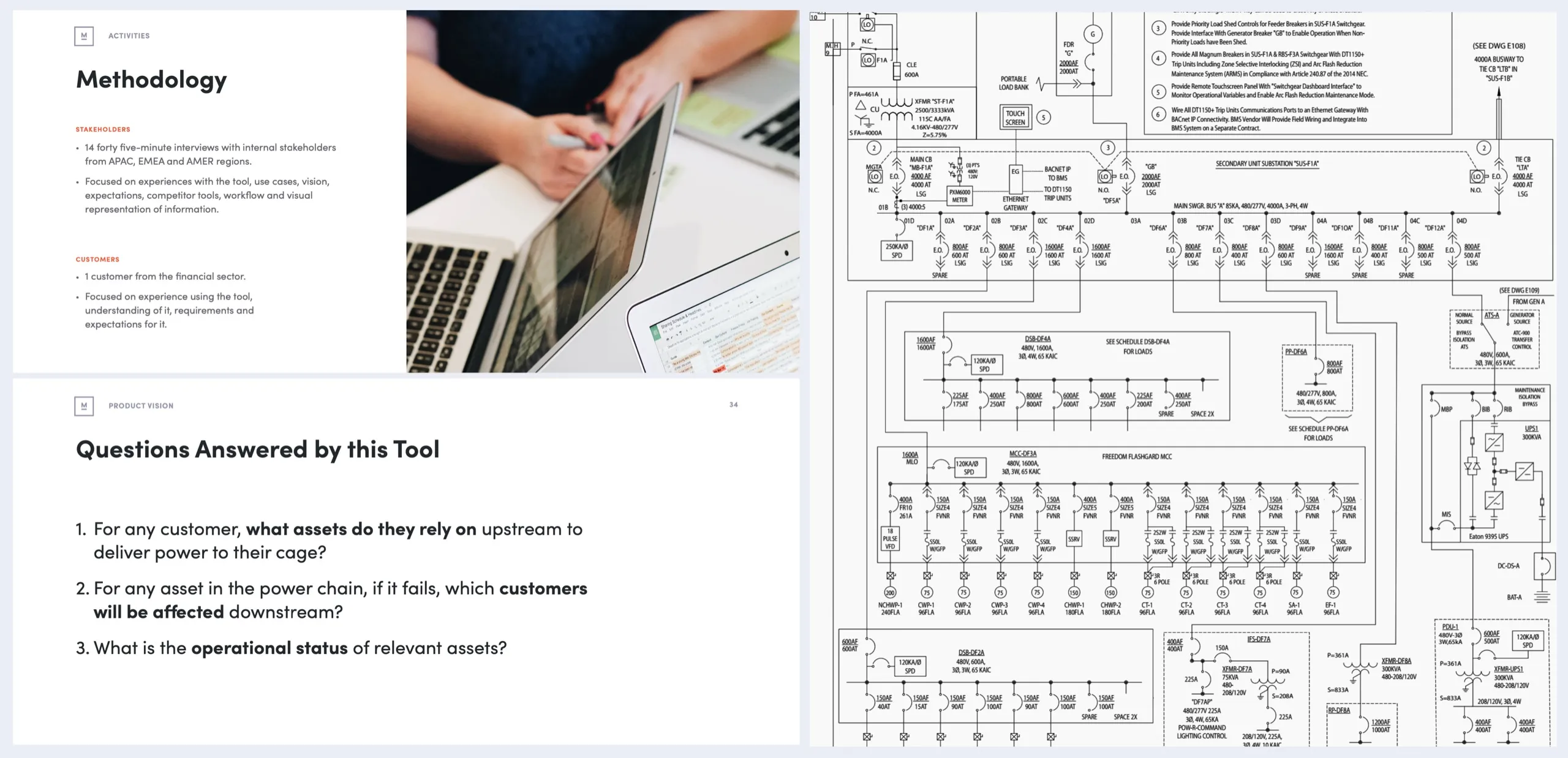
A critical discovery emerged: the team that originally built the tool had left Equinix with no documentation behind them. Rebuilding meant starting from scratch.
What the market offered
Rather than designing into a vacuum, I dove deep into the domain. Neither of us knew much about data center monitoring tools — so we spoke with everyone who did, and ran a thorough competitive analysis to understand what the landscape offered.
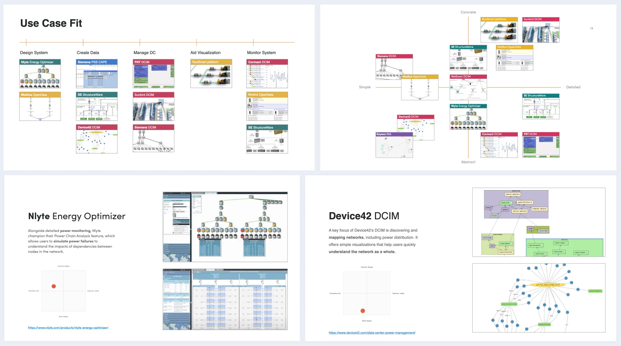
The synthesis revealed key patterns: what made existing tools useful (customization, quick selection, contextual data), and where they fell short for Equinix’s specific workflows.
A direction from the data
With a clearer picture of user needs and what the market offered, I worked through wireframe sketches and information architecture iterations to define a framework that could support both flexibility and consistency.
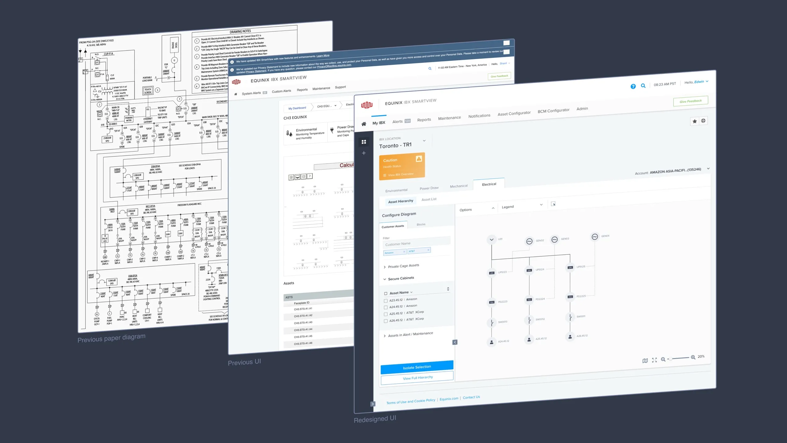
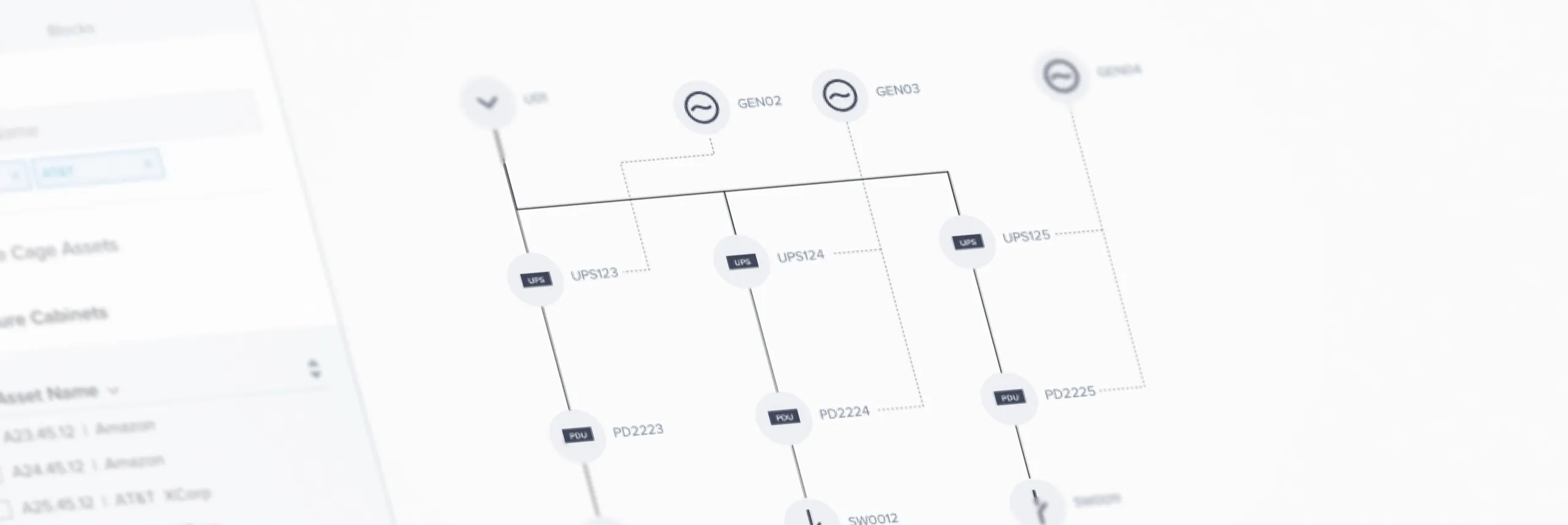
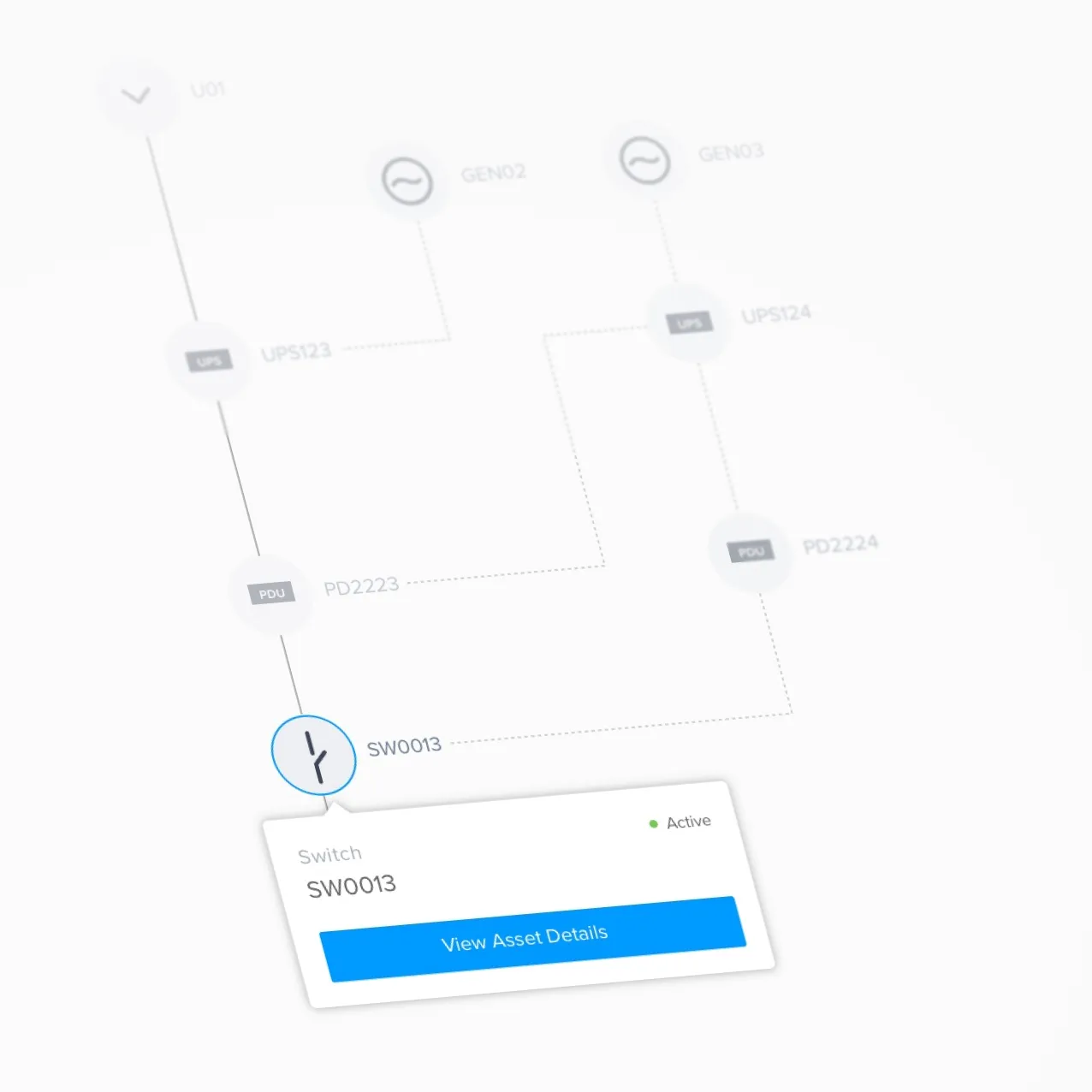
Design outputs included custom icons for infrastructure components, quick selection actions to speed up navigation, and contextual data panels that surfaced the right information at the right moment.
Research said don’t build
Rebuilding was too expensive. The existing tool couldn’t be incrementally improved due to zero documentation. A ground-up overhaul was cost-prohibitive relative to the value it would deliver.
Users were already using other tools. Our research surfaced the workarounds users had quietly adopted. That data gave business leaders something concrete to act on.
Competitive analysis informed the right choice. Our evaluation criteria came from user needs and workflows, not vendor pitches. The result: Equinix onboarded a third-party tool that met real user needs.
Outcome
- For the business: a costly ground-up rebuild avoided, saving significant development spend.
- For customers: a vendor tool chosen against real workflows, instead of a rebuild no one would use.
- For the team: an audit, interviews, and competitive analysis that stayed behind as decision data.
The value of saying no
As designers we push for our designs to be built. But understanding the cost of building is equally important. Research lets a designer provide value far beyond creating user interfaces — including the value of a well-reasoned recommendation not to build. Knowing what not to plant is part of tending a system. And the work outlasted the decision: the audit, interviews, and competitive analysis stayed behind as decision data the team kept drawing on.